Overview
This article delineates four best practices essential for designing forms that significantly enhance the success of Software as a Service (SaaS) applications:
- Focus on simplicity
- Effective layouts
- User feedback
- Brand alignment
Each practice is bolstered by research and practical strategies. These practices are pivotal in improving user experience and conversion rates by minimizing complexity, facilitating navigation, and ensuring brand consistency. By implementing these strategies, SaaS providers can create more intuitive and engaging user interfaces, ultimately driving greater satisfaction and loyalty among users.
Introduction
Designing forms for Software as a Service (SaaS) applications transcends mere technicality; it is a crucial factor that can significantly influence user engagement and conversion rates. By emphasizing simplicity, effective layouts, and user feedback, companies can craft forms that not only gather essential information but also elevate the overall user experience. Yet, with numerous best practices to consider, how can SaaS providers ensure their forms distinguish themselves and drive success? This article explores four best practices that can transform form design into a strategic advantage, ultimately resulting in heightened user satisfaction and improved conversion outcomes.
Prioritize Simplicity in Form Design
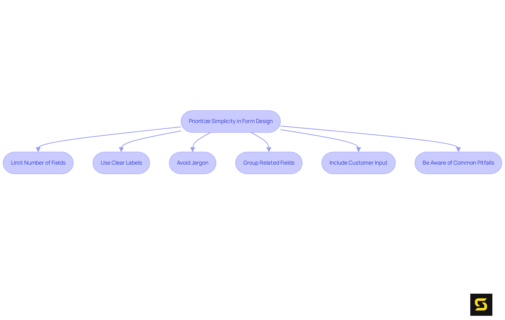
To achieve simplicity in form design, consider the following strategies:
- Limit the Number of Fields: Request only essential information to minimize user fatigue. Studies indicate that documents with fewer sections can significantly enhance completion levels; indeed, decreasing the number of sections can lead to an almost 50% rise in conversions. For instance, reducing a form from four sections to three can boost conversion rates by nearly 50%.
- Use Clear Labels: Each field should have a clear and concise label specifying the required information. Relying on placeholders can create confusion, as users may forget what information is necessary once they begin typing.
- Avoid Jargon: Employ straightforward language that is easily understood by all users. This approach enhances accessibility, ensuring that the form caters to a diverse audience.
- Group Related Fields: Organize fields logically to facilitate easier navigation. For example, group personal information separately from payment details, assisting users in processing the information more efficiently.
- Include Customer Input: Consistently gather feedback from customers to understand brand perception and enhance layout design. This practice can lead to ongoing improvements in user experience.
- Be Aware of Common Pitfalls: Avoid typical missteps, such as utilizing CAPTCHAs, which can lower submission completion rates by as much as 40%.
By implementing these strategies, SaaS firms can create documents in a design form that not only operate efficiently but also significantly enhance the overall user experience.

Utilize Effective Layouts and Field Ordering
To optimize layouts and field ordering in SaaS applications, it is essential to implement best practices that enhance user experience and drive results:
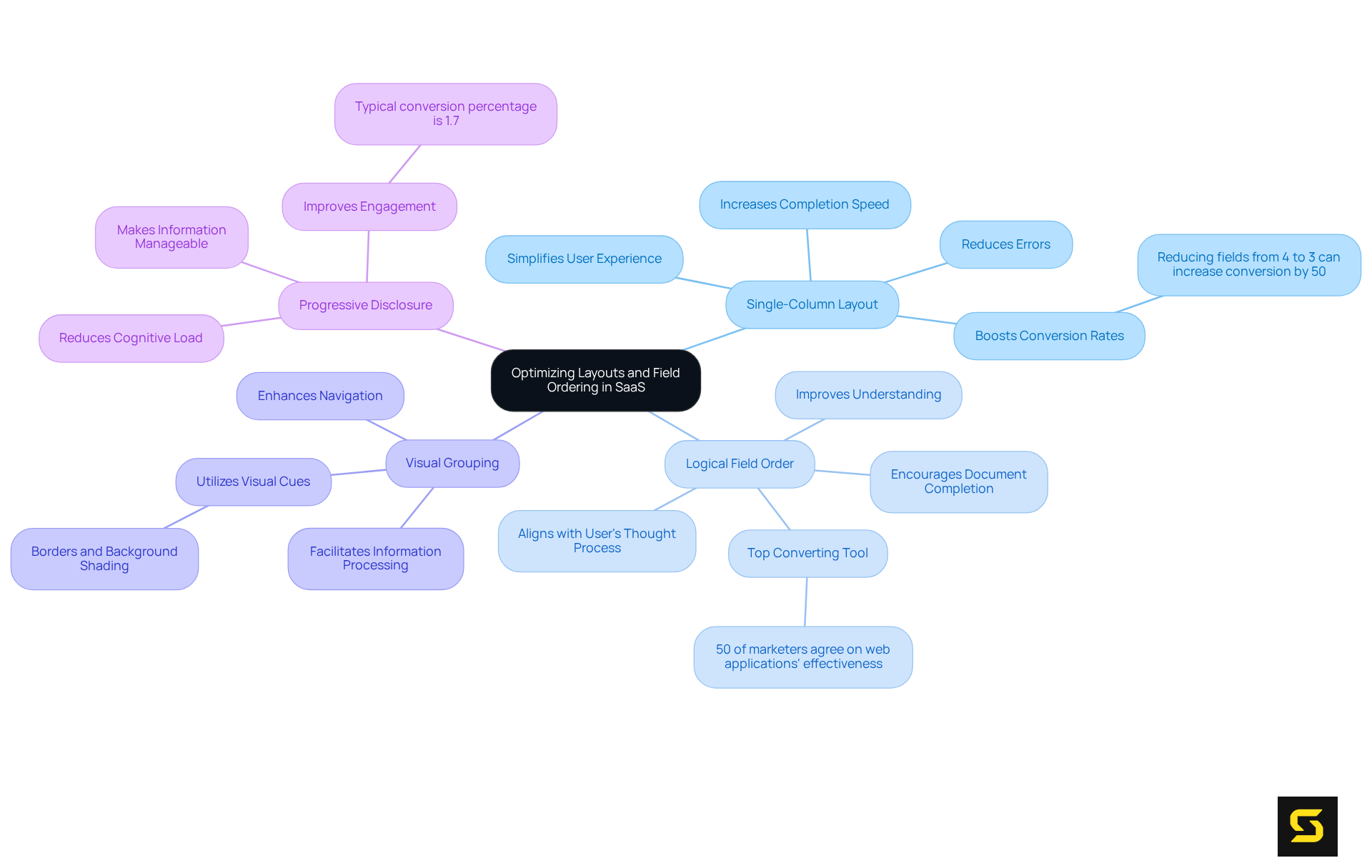
- Single-Column Layout: Adopting a single-column format for forms significantly simplifies the user experience. This approach not only makes it easier for users to follow but also reduces errors. Research indicates that single-column layouts can be completed considerably faster than their multi-column counterparts, thereby improving overall efficiency. In fact, reducing a form from four sections to three can enhance conversion rates by nearly 50%, as noted by Quicksprout.
- Logical Field Order: It is crucial to arrange sections in a sequence that aligns with the user's thought process. Begin with straightforward areas and gradually progress to more complex ones. This logical flow not only aids understanding but also encourages users to complete the document. Hubspot emphasizes that nearly 50% of marketers agree that web applications serve as their top converting lead generation tools, underscoring the importance of efficient ordering.
- Visual Grouping: Employing visual cues, such as borders or background shading, to group related fields can significantly assist users in processing information more efficiently. This method facilitates easier navigation through the document.
- Progressive Disclosure: For applications that require extensive information, consider breaking them into multiple steps or sections. This strategy reduces the cognitive load on users, making the process feel less overwhelming and more manageable. The typical , indicating that enhancing design can lead to substantial improvements in engagement.
By applying these design form techniques, you can significantly enhance user experience and increase completion rates, ultimately leading to better outcomes for SaaS applications. Additionally, it is vital to be vigilant of common pitfalls, such as overly complicated documents or vague guidelines, which can deter users from finalizing their submissions.

Enhance User Feedback and Validation Processes
To enhance user feedback and validation, it is essential to implement best practices that drive engagement and satisfaction:
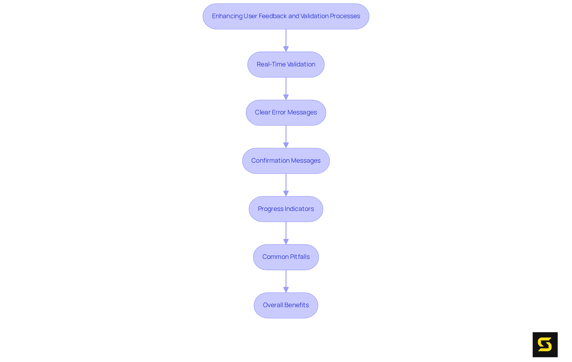
- Real-Time Validation: Implement inline validation to provide immediate feedback as users complete fields. This approach allows individuals to correct mistakes before submitting their documents, significantly reducing abandonment rates. Research indicates that keeping forms concise, with only essential fields, lowers the likelihood of abandonment, as users are more inclined to engage with straightforward inputs.
- Clear Error Messages: When errors arise, it is crucial to deliver clear and constructive error messages that explain the issue and guide users on how to resolve it. Avoid technical jargon to ensure that feedback is easily understood. Gentle error communication can alleviate participant stress and encourage corrections, ultimately enhancing satisfaction with the form-filling experience.
- Confirmation Messages: After submitting their information, users should receive a confirmation message to reassure them that their input has been successfully received. This practice not only fosters trust but also with the process.
- Progress Indicators: For multi-step procedures, incorporating progress indicators is vital to inform users of their advancement through the process. This functionality encourages completion by providing a visual representation of their progress.
- Common Pitfalls: Be wary of typical layout design mistakes, such as making every field required or overusing drop-down menus, as these can disrupt flow and lead to frustration.
By prioritizing client feedback and validation, SaaS companies can create a more engaging and customer-friendly experience, ultimately driving higher conversion rates and client satisfaction.

Incorporate Customization for Brand Alignment
To effectively incorporate customization for brand alignment, consider these strategic approaches:
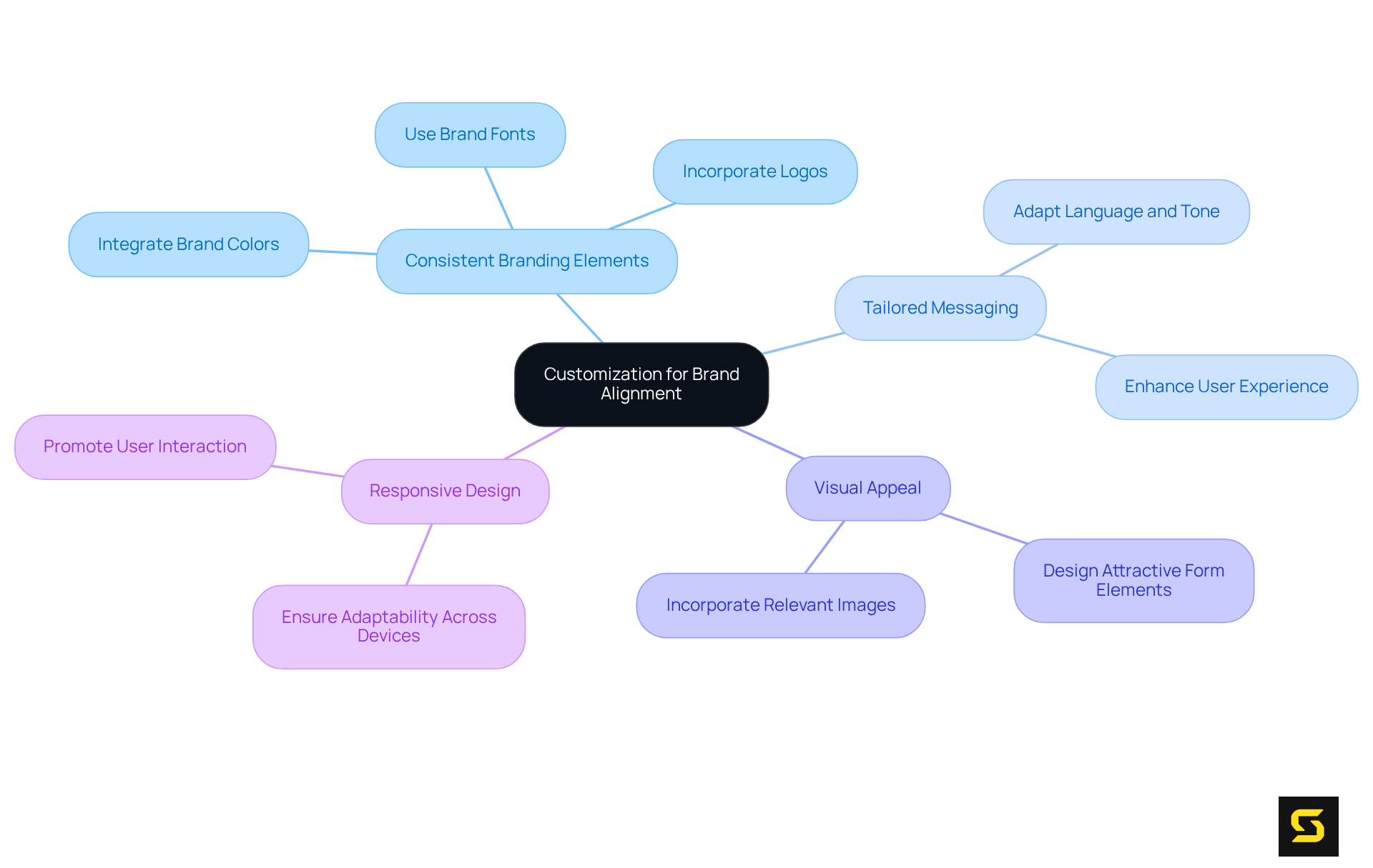
- Consistent Branding Elements: Integrate your brand's colors, fonts, and logos into form design to establish a cohesive appearance that reflects your overall brand identity. This consistency fosters recognition and instills confidence among users.
- Tailored Messaging: Adapt the language and tone of the document to resonate with your brand's voice. This personalization , making interactions feel more relevant and engaging.
- Visual Appeal: Design form elements to be visually attractive, aligning with your brand's aesthetic. Incorporating images or graphics that connect with your target audience can significantly enhance engagement.
- Responsive Design: Ensure that inputs are adaptable and visually appealing across all devices. A seamless experience reinforces brand professionalism and promotes user interaction.
By aligning form design with brand identity, SaaS companies can significantly enhance user trust and engagement, ultimately leading to higher conversion rates.

Conclusion
Designing effective forms is not merely a task; it is a critical component for achieving success in SaaS applications. By prioritizing simplicity, utilizing effective layouts, enhancing user feedback, and incorporating brand alignment, companies can significantly improve user experience and increase conversion rates. These best practices streamline the user journey and foster trust and engagement—essential elements for retaining customers in a competitive landscape.
The article emphasizes several key strategies:
- Limit the number of fields to reduce user fatigue.
- Implement clear labeling and logical field ordering to guide users.
- Utilize real-time validation to enhance the form-filling experience.
- Align form design with brand identity through consistent elements and tailored messaging.
Ultimately, the significance of form design in SaaS cannot be overstated. By adopting these best practices, businesses can create forms that are not only functional but also engaging and reflective of their brand. This holistic approach to form design is essential for driving higher completion rates, improving user satisfaction, and ultimately achieving greater success in the SaaS market. It is time for SaaS companies to prioritize form design as a vital element of their user experience strategy, ensuring that every interaction contributes positively to their overall goals.
Frequently Asked Questions
What is the main goal of prioritizing simplicity in form design?
The main goal is to enhance user experience by making forms easier to complete, thereby increasing conversion rates.
How can limiting the number of fields in a form improve completion rates?
Requesting only essential information minimizes user fatigue, and studies show that reducing the number of sections in a form can lead to nearly a 50% increase in conversion rates.
Why is it important to use clear labels for form fields?
Clear and concise labels help users understand what information is required, whereas relying on placeholders can create confusion.
What type of language should be used in form design?
Straightforward language should be used to ensure that the form is easily understood by all users, enhancing accessibility.
How should related fields be organized in a form?
Related fields should be grouped logically, such as separating personal information from payment details, to facilitate easier navigation for users.
Why is customer input important in form design?
Gathering feedback from customers helps understand brand perception and can lead to ongoing improvements in layout design and user experience.
What common pitfalls should be avoided in form design?
Common pitfalls include using CAPTCHAs, which can decrease submission completion rates by as much as 40%.


